New dashboard design confusing
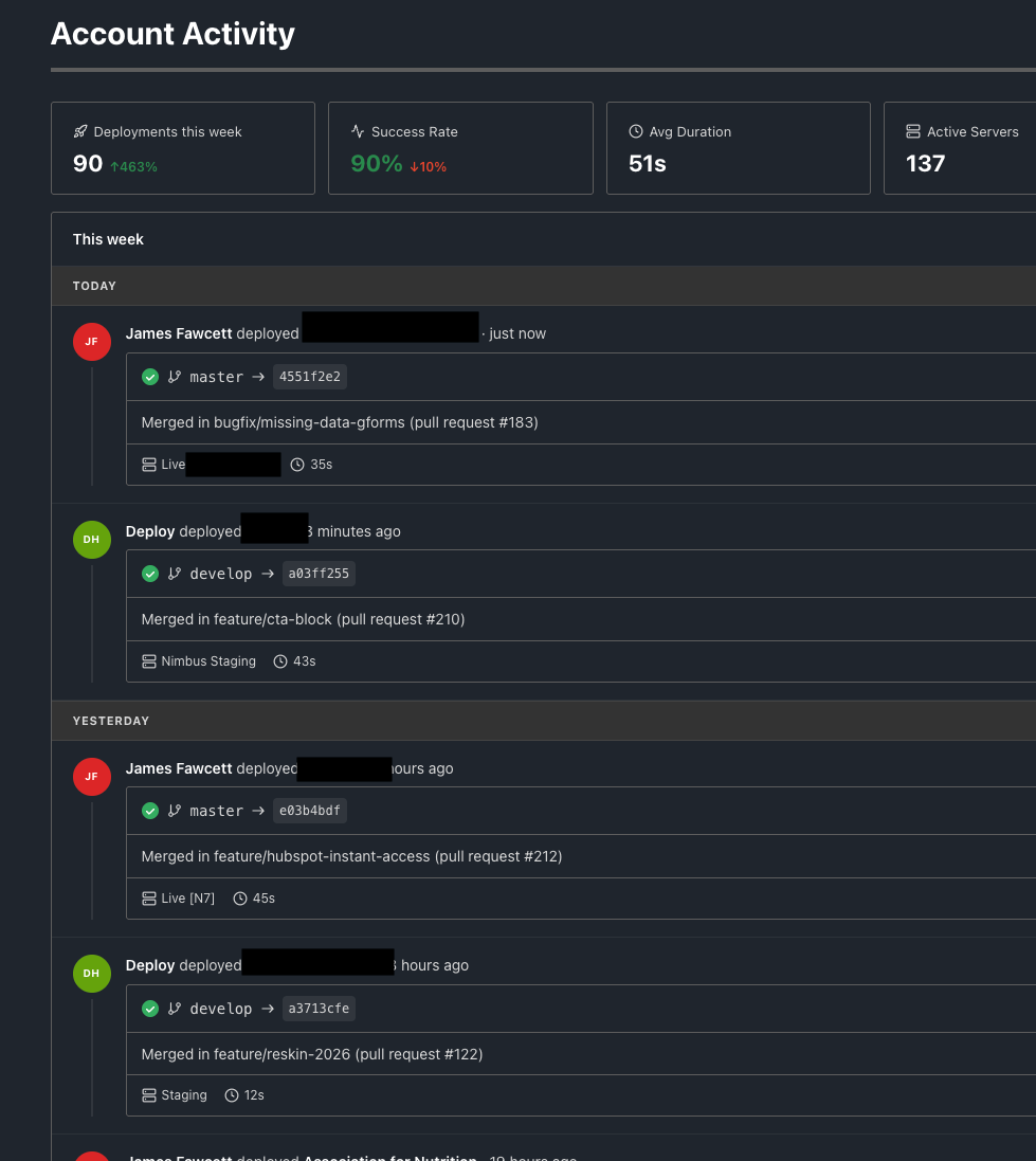
The new dashboard design makes it more confusing. On the old design, you could look in one glance to see any issues or if deployments failed just by colour. The new design you have to study to check the details, its not as clear.
Please authenticate to join the conversation.
Upvoters
Status
Completed
Board
💡 Feature Request
Date
4 months ago
Author

James Fawcett
Subscribe to post
Get notified by email when there are changes.
Upvoters
Status
Completed
Board
💡 Feature Request
Date
4 months ago
Author
James Fawcett
Subscribe to post
Get notified by email when there are changes.